.
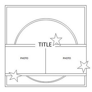
I combined a couple of challenges for this one - the weekly challenge on the UKScrappers forum, to use a beach theme, the colour turquoise, and two photos - and the Sarah's Cards Ltd Blog September Challenge sketch:
I've used a fair amount of the new Pink Paislee Nantucket collection on this layout - I love it! Gorgeous colours and patterns, and the beach theme is great for me as we live near the sea and have a lot of beach photos.
I used four sheets from the 6x6 paper pack to make the circle in the background. To make sure my circle quarters were all even in size I drew around a plate onto a spare piece of paper, then folded it into quarters, and used this as a template on the Nantucket papers:
I placed them on my cardstock (which I'd machine stitched a border around with pale yellow thread) with a 2cm gap in between the circle quarters, and began layering everything else on top.
I knew I was going to like the Nantucket items, but when they arrived I was also pleasantly surprised to see how much you get for your money in the Ephemera:
So many pretty bits and pieces to choose from! I used them all around the page, including under and next to my title, for which I used a Nantucket wood shape. I painted it with pink acrylic paint with a bit of pumice texture gel mixed in to make it look sandy (you could mix in actual sand instead if you have some!):
The scalloped turquoise strip below my photos is some Pink Paislee Mistables Scallop Muslin Ribbon. I coloured it by watering down acrylic paint in an old plastic food pot, and then dunking my ribbon in until it was coated:
I squeezed the excess out, and hung it to dry overnight, with some newspaper underneath to catch any drips. Once dry, I used my Crop-A-Dile Big Bite to punch holes along the scallops, and a white opaque gel pen to add a wavy white edge (the acrylic paint had stiffened the muslin so it was easier to do these two steps - they might not work if you'd coloured the ribbon by misting it. I don't know - I haven't tried!):
The final touch was punching some little suns from the left over 6x6 pieces, and adding them to the layout with 3D dots. I also added the word 'sand' (which was originally 'sand castle' in the ephemera pack) to the top left corner over a tiny tag from the ephemera and a flag which I'd cut from a scrap of the 6x6 paper:
So there we go. What do you think? I warn you, there may be some more projects using Nantucket coming up - I have lots of ideas for how to use it!
Do you have any favourite collections at the moment? x


11 comments:
great layout and I enjoyed your tutorial. The muslin border turned out well too....fab idea!
Lovely photos and the page is so effective with all the extra details! x
Not seen this Nantucket stuff previously but it looks wonderful. I love the sandy looking title there too. My DH works weekends sometimes and I hate it - feels so much worse than during the week for some reason. We have to be grateful they have jobs though :-)
Lovely layout, Jennifer!
That's a very pretty layout - love the soft cool colors.
Love how you did the circle, such cute pictures and fantastic embellies!!!
Ooh, I do love the look of that Nantucket - those little fish add a special touch here I think. I'm holding out for some OA farmhouse. That collection has my name all over it.
Love what you did with the muslin...great papers and LO!
Alison xx
I really like how you split the circle into quarters of patterned paper, greta idea.
Thanks for joining in with our challenge.
So many great things going on here. I also adore the Nantucket collection especially the die cuts.Love your mistable muslin.
Wow! I'd seen this on UKS but had no idea how much work had gone into it until I read your blog. Fab tips on using pumice gel and colouring the ribbon - thank you! Thanks for playing along with us at Sarahs Cards xxx
Post a Comment